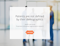
LAVIDGE 2020 Healthcare Study: Proprietary Attitudinal Segmentation Research
Marketing research on the healthcare industry—before and during the COVID-19 pandemic.

Wham! It hits you. The insight, the big idea, the game changer. We help our clients find the treasured nuggets that drive engagement, motivate action and generate repeat business. Industry experience combined with proprietary research illuminate the way forward.
Marketing research on the healthcare industry—before and during the COVID-19 pandemic.
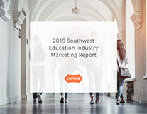
Gain a deeper understanding of unique attitudes and motivations related to education decisions.
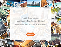
Learn what marketing tactics consumers prefer most when considering hotels and resorts based on annual income, age and familiar status.
Our insightful sports marketing study sifts through consumer preferences based on age, income and familial status, so you can tailor your approach.
What’s the one word all buyers most want to hear from their homebuilder? Learn this and more.
If you offer technology products, services or both, you need to get your own copy of this important new report.
If you operate restaurants or other food service businesses, you need to get your hands on this important new report.
If you own or market fitness clubs, hair and nail salons, massage clinics, spas, nutritionals, vitamins or beauty products, you need to download this exclusive report on marketing retail services.
This exclusive and authoritative study takes the guesswork out of healthcare advertising and marketing. Rather than speculating about what will drive consumers to action, we’ve asked them.
 Stephen HeitzStephen HeitzStephen HeitzStephen HeitzStephen HeitzStephen HeitzStephen Heitz
 Tim TrullStephen HeitzStephen Heitz
 Betsey Griffin Jones
 Shaun JensenTim Trull
 Anne RobertsonBetsey Griffin JonesStephen HeitzStephen Heitz
 Dave NobsStephen HeitzStephen HeitzDave NobsDave Nobs
 Bob CaseBob CaseTim TrullStephen HeitzStephen HeitzStephen HeitzStephen Heitz
 Kylie LavidgeTim TrullTim TrullBob CaseBob CaseStephen HeitzStephen HeitzTim TrullStephen HeitzStephen Heitz
 Alicia WadasTim TrullBob CaseStephen HeitzStephen HeitzStephen HeitzStephen HeitzBob CaseBob CaseStephen HeitzStephen HeitzTim TrullStephen HeitzStephen HeitzAnne RobertsonStephen HeitzStephen HeitzBetsey Griffin JonesStephen HeitzBob CaseStephen HeitzStephen HeitzAlicia WadasStephen HeitzAnne RobertsonStephen HeitzStephen HeitzBob CaseShaun JensenBetsey Griffin JonesStephen HeitzStephen HeitzStephen HeitzStephen HeitzStephen HeitzStephen HeitzBetsey Griffin JonesStephen HeitzStephen HeitzStephen HeitzStephen HeitzTim TrullStephen Heitz
 Bill LavidgeAnne RobertsonStephen HeitzAnne Robertson
PHOENIX (April 16, 2024) – Dave Nobs, Managing Director of Growth & Development at LAVIDGE, has joined the prestigious Walter Cronkite School of Journalism and Mass Communication Endowment Board of Trustees.....read more
PHOENIX - (March 28, 2024) – LAVIDGE President and Chief Financial Officer Sandra Torre recently shared with Greater Phoenix InBusiness Magazine the agency’s philosophy for enhancing succession planning for leadership roles.....read more
PHOENIX - (March 13, 2024) – The LAVIDGE team accepted six agencywide awards and a prestigious specialty award in the 2024 Phoenix Ad Club ADDYs presented on Friday at the Fairmont Scottsdale Princess. ....read more
PHOENIX (March 11, 2024) – LAVIDGE is honored to hold the No. 1 ranking for Best Advertising in the AZ Big Media’s Ranking Arizona magazine—for the 13th consecutive year.....read more
PHOENIX (Dec. 11, 2023) – Employees nominated by and voted on by their peers for excellence in five key categories accepted their awards on Friday during the annual LAVIDGE Holiday party.....read more
PHOENIX - (Oct. 26, 2023) – LAVIDGE was honored today with 12 2023 TIM Awards; 10 for Excellence and one for Mastery—and one for building community.....read more
PHOENIX (Oct. 17, 2023) – LAVIDGE PR took home on Thursday an Award of Merit from the Public Relations Society of America (PRSA) Phoenix Chapter’s annual Copper Anvil Awards.....read more
PHOENIX - (Oct. 10, 2023) – LAVIDGE is proud to be among the largest Phoenix-area public relations firms in the 2023 Phoenix Business Journal Book of Lists. ....read more
PHOENIX (Oct. 5, 2023) – LAVIDGE IMPACT volunteers returned to Hope for Hunger food bank this week to help Phoenix Rescue Mission pack food boxes and fill grocery carts for people experiencing food insecurity.....read more
PHOENIX (Sept. 29, 2023) – Executive VP and Chief Financial Officer Sandra Torre is being honored by AZ Big Media as a 2024 Az Business Angel for her role at LAVIDGE overseeing the employee volunteer committee.....read more
PHOENIX - (Sept. 13, 2023) – LAVIDGE Executive Vice President and Chief Operating Officer Alicia Wadas describes her life as “blessed, dynamic and a fulfilling journey.” ....read more
PHOENIX (August 21, 2023) — LAVIDGE is pleased to announce several new clients.....read more
PHOENIX - (Aug. 18, 2023) – LAVIDGE is proud to be recognized as the 5th-largest Phoenix-area advertising firm in the 2023 Phoenix Business Journal Book of Lists.....read more
PHOENIX - (July 17, 2023) – LAVIDGE is honored to be an azcentral 2023 Top Workplace—for the third consecutive year.....read more
PHOENIX - (July 14, 2023) – LAVIDGE is proud to announce it is a winner in the Arizona Capitol Times 2023 Top Companies to Work for in Arizona.....read more
PHOENIX - (July 14, 2023) – LAVIDGE is proud to be among the largest Phoenix-area interactive marketing firms in the 2023 Phoenix Business Journal Book of Lists.....read more
PHOENIX - (June 30, 2023) – It’s an annual tradition for LAVIDGE to participate in back-to-school community service events. ....read more
PHOENIX - (May 22, 2023) Readers of Jewish News for the second consecutive year have voted LAVIDGE as the valley's Best Advertising Agency.....read more
PHOENIX - (May 11, 2023) - LAVIDGE is proud to announce being among the winners at the 2023 American Marketing Association (AMA) Phoenix Spectrum Awards reception held today at the Arizona Science Center.....read more
SCOTTSDALE - (May 6, 2023) – Many familiar faces from LAVIDGE lined up on Saturday at Continental Golf Course to raise funds for suicide prevention programs.....read more
PHOENIX - (April , 28, 2022) - LAVIDGE IMPACT volunteers were among 400 who showed up on Friday to lend a hand during 2023 Maricopa County StandDown. ....read more
PHOENIX - (April , 12, 2023) LAVIDGE IMPACT volunteers get their hands dirty for a good cause.....read more
PHOENIX (March 30, 2023) – LAVIDGE has earned the No. 1 rank for Best Advertising for the twelfth consecutive year in AZ Big Media’s annual Ranking Arizona. ....read more
PHOENIX – (March 10, 2023) – LAVIDGE work for multiple clients earned distinction in the 2023 Phoenix chapter’s American Advertising Awards presented by the Phoenix chapter of the American Advertising Federation.....read more
PHOENIX – (Feb. 13, 2023) – LAVIDGE Chief Creative Officer Bob Case joined Fox 10’s Arizona Morning show today to critique Super Bowl ads, keeping alive the years-long tradition with anchors Troy Hayden and Syleste Rodriguez.....read more
PHOENIX – (Feb. 9, 2023) – LAVIDGE is proud to announce that Sandra Torre is among 26 honorees selected from a field of nearly 200 candidates for the Phoenix Business Journal’s 2023 Outstanding Women in Business.....read more
PHOENIX (Jan. 3, 2023) – Anne Robertson, Managing Director of Public Relations and Publicity for LAVIDGE, is among three public relations professionals highlighted in "AzBusiness Leaders 2023" magazine. ....read more
PHOENIX (Jan. 3, 2023) – Bill Lavidge, president, founder and CEO of LAVIDGE, is among five advertising professionals highlighted in "AzBusiness Leaders 2023" magazine. ....read more
PHOENIX (Dec. 16, 2022) – Continuing a tradition begun just last year, LAVIDGE presented its 2022 LAVY Awards today to five top winners as part of an agencywide holiday and year-end celebration honoring excellence as recognized by their peers.....read more
PHOENIX (Nov. 9, 2022) – It takes a village to feed the homeless.....read more
PHOENIX - (Nov. 7, 2022) – Alec Esteban Thomson has been named an Arizona Capitol Times 2022 Cap Under 40 Honoree. ....read more
PHOENIX (Nov. 2, 2022) – LAVIDGE has added several new clients to its roster this year from a variety of industry verticals.....read more
PHOENIX (Oct. 24, 2022) – LAVIDGE accepted a dozen awards on Thursday at the 2022 Arizona Innovation Marketing Association (AZIMA) Tim Awards celebration dinner and presentation staged at the Tempe Center for the Arts.....read more
PHOENIX (Oct. 14, 2022) – Who would have guessed that volunteering to cuddle pigs would not only be fun, but become a LAVIDGE IMPACT volunteer favorite?....read more
PHOENIX (Sept. 13, 2022) – LAVIDGE is pleased to announce being selected by AZ Business magazine and BestCompaniesAZ for Arizona’s Most Admired Companies of 2022. ....read more
PHOENIX (August 29, 2022) – LAVIDGE is honored to have made the 2022 list published by Arizona Capitol Times and Best Companies Group honoring the Top Companies to Work for in Arizona.....read more
PHOENIX (July 22, 2022) – LAVIDGE is honored to be among 77 small businesses (149 or fewer employees) recognized by AZ Central's 2022 Top Work Places award.....read more
PHOENIX - (June 29, 2022) – Many school children lack the means to obtain the basics each year when it’s time to return to the classroom.....read more
PHOENIX - (June 22, 2022) – Every child deserves snack time. ....read more
PHOENIX – (June 14, 2022) – LAVIDGE is proud to announce that Alec Esteban Thomson has been selected from a field of more than 400 candidates for the Phoenix Business Journal’s 40 under 40 Class of 2022.....read more
PHOENIX - (May 18, 2022) – Seven employees and one family member devoted their morning today to sort donations at Nourish Phoenix food and clothing bank through LAVIDGE IMPACT.....read more
PHOENIX - (April 30, 2022) – LAVIDGE IMPACT volunteers participated today in Hope4Kids International’s virtual walk fundraiser to provide safe, clean water to children.....read more
PHOENIX - (April 27, 2022) - A group of marketing, advertising and other professionals joined LAVIDGE remotely on Tuesday to participate in “Multicultural Matters |Grow reach and results: ....read more
PHOENIX – (April 4, 2022) – LAVIDGE Public Relations has been recognized by O’Dwyer’s Top PR Firms – 2022 Firm Rankings as among the nation’s best. ....read more
PHOENIX - (March 25, 2022) - LAVIDGE—for the 11th consecutive year—has earned the No. 1 rank for ad agencies in its category with the release of AZ Big Media's 2022 edition of Ranking Arizona magazine.....read more
PHOENIX - (March 23, 2022) - Imagine a nice, quiet place where retired racehorses can eat hay, bask in the Arizona sunlight and otherwise be spoiled—without so much as a hint of a starting gate anywhere nearby.....read more
PHOENIX - (March 14, 2022) - LAVIDGE brought home seven awards for work produced across the agency and one of the most prestigious individual awards in the 2022 Phoenix Ad Club ADDYs presented on Thursday at the historic Orpheum Theater in Phoenix.....read more
PHOENIX - (March 14, 2022) – Ten dogs and two cats represented LAVIDGE IMPACT in Southwest Human Development’s 2022 Pet-a-Palooza photo contest to benefit children.....read more
PHOENIX (March 10, 2022) – Being honored with the Phyllis Ehlinger Women of Excellence Award is a rare opportunity—a distinction reserved for an elect group of businesswomen who embody qualities of the highest caliber.....read more
PHOENIX (Feb. 14, 2022) - With popularity of the Olympic Games waning in recent years can they ever regain the worldwide appeal they once held?....read more
PHOENIX (Oct. 21, 2020) – LAVIDGE took home 13 awards from the 2021 Arizona Innovation Marketing Association (AZIMA) TIM Awards presented live Oct. 21 at the Warehouse 215 @Bentley Projects in downtown Phoenix.....read more
PHOENIX (Oct. 19, 2021) – LAVIDGE is proud to be among the top-three finalists honored today in the small business category for Corporate Volunteerism in the Phoenix Business Journal’s 2021 Corporate Philanthropy Awards.....read more
PHOENIX (Aug. 24, 2021) – LAVIDGE is proud to be named among the 2021 Top 100 Companies to Work for in Arizona.....read more
PHOENIX (Aug. 21, 2021) — This year, at the 27th annual VYTal Affair-athon, Bill Lavidge was awarded with the Individual VYTALITY Award this past Saturday from Valley Youth Theatre (VYT). ....read more
PHOENIX (Aug. 23, 2021) – LAVIDGE is delighted to announce its inclusion on the AZ Business magazine and BestCompaniesAZ list of Arizona’s Most Admired Companies of 2021. ....read more
PHOENIX (Aug. 23, 2021) – LAVIDGE is proud to announce it has earned high honors by ranking fourth in the Phoenix Business Journal’s Largest Phoenix-Area Advertising Agencies based on strong capitalized billings in 2020.....read more
PHOENIX (Aug. 3, 2021) - Bill Lavidge is one of 11 CEOs selected to contribute a bylined article published in In Business Magazine on how businesses will rebuild after COVID-19.....read more
PHOENIX (July 16, 202) - LAVIDGE IMPACT volunteers pulled together to organize school supplies and backpacks they donated for Save the Family Foundation's 2021 back-to-school drive.....read more
PHOENIX (July 12, 2021) – LAVIDGE is twice honored to have earned AZ Central and Energage's 2021 Spirit Award for its celebratory video created by and for LAVIDGE employees after learning the agency was a Top Work Place winner.....read more
PHOENIX (July 12, 2021) – LAVIDGE is honored to be ranked No. 30 among 51 small businesses recognized on Sunday by AZ Central's 2021 Top Work Places award.....read more
PHOENIX (June 16, 2021) - Are you "customer centric" enough?....read more
PHOENIX (June 21, 2021) – In a guest column published today by O’Dwyer’s, LAVIDGE Managing Director of Business ....read more
PHOENIX (June 18, 2021) – LAVIDGE IMPACT volunteers worked side-by-side with Nourish Phoenix regulars and members of the Arizona National Guard on a recent Friday morning sorting clothing and packing food boxes for those in need.....read more
PHOENIX (May 14, 2021) – Nine LAVIDGE employees stepped up on May 14 to spend two hours of their Friday morning sorting donations at Harvest Compassion Center in North Phoenix.....read more
PHOENIX (May 7, 2021) – A pandemic. A largely closed economy. An unemployment rate at an all-time high. And all sorts of political and civil unrest. Let’s face it. Life since early 2020 has been tough.....read more
PHOENIX (April 5, 2021) – With a solid chance of making the NBA playoffs for the first time in more than a decade, it’s a great time for the Phoenix Suns to explore ways to cash in.....read more
PHOENIX (March 31, 2021) – LAVIDGE successfully defended its No. 1 rank for Best Advertising in the 2021 Ranking Arizona competition in addition to showing well.....read more
PHOENIX (March 29, 2021) - LAVIDGE took home 10 awards on Friday at the Phoenix Ad Club’s 2021 ADDYS livestreamed from Phoenix’s 13,000-seat Orpheum Theater.....read more
PHOENIX (Feb. 19, 2021) – Giving back has become second nature for LAVIDGE employees who frequently provide community service through IMPACT, the Phoenix-ad agency’s employee volunteer program.....read more
PHOENIX (Feb. 1, 2021) – LAVIDGE, a leading advertising, public relations and digital marketing agency, announced today the....read more
PHOENIX (June 5, 2020) - LAVIDGE IMPACT delivered numerous bags of donations this month to Interfaith Cooperative Ministries (ICM), along with donating about 24 hours of time.....read more
PHOENIX (May 14, 2020) - Increase advertising, modulate tonality, be authentic, and be helpful. That's the bottom line contained in sage advice Dave Nobs delivered as a guest on "How to Win in an Economic Downturn," for the May 7th episode of the Marketing Agency Leadership Podcast.....read more
PHOENIX (May 11, 2020) - "We've gotta sell hope." That's the message beloved Arizona State University Head Football Coach Herm Edwards has been delivering to audiences both online and in person since early April.....read more
PHOENIX (April 28, 2020) - LAVIDGE IMPACT will give back in May by fulfilling the wishlist of Interfaith Cooperative Ministries (ICM) to help them meet the basic needs of the disadvantaged.....read more
PHOENIX (April 20, 2020) - LAVIDGE IMPACT, now in its second year, has already established a history of successful group events to improve lives in the communities we serve, with a special focus on children and animals.....read more
PHOENIX - (April 13, 2020) - Bob Case, LAVIDGE Chief Creative Officer, appeared today with Troy Hayden on Fox10's Arizona Morning discussing how brands are updating their advertising messaging in response to the COVID-19 crisis.....read more
PHOENIX (March 30, 2020) – LAVIDGE IMPACT exceeded its March goal to raise $500 to benefit Arizona children with disabilities, by sponsoring 18 employees who signed up for the annual Walk with Me Family Fun Run and 5K hosted by Southwest Human Development (SWHD).....read more
PHOENIX (March 13, 2020) – LAVIDGE and its employees earned recognition at the 2020 Phoenix ADDY Awards which, due to social distancing guidelines, were presented virtually this year during a live webcast hosted by the Phoenix Ad Club.....read more
For the 9th year consecutive year, LAVIDGE is honored to be named the No. 1 Advertising Agency in AZ Big Media's Ranking Arizona 2020 annual awards.....read more
PHOENIX (March 9, 2020) - invisionAZ’s debut CONVERGE Tech Summit at the Waste Management Phoenix Open attracted extensive media coverage, thanks to LAVIDGE.....read more
PHOENIX (Feb. 18, 2020) – The LAVIDGE Ad Libs Toastmasters Club, hosted and sponsored by the LAVIDGE advertising agency since November 2018, has officially chartered with Toastmasters International.....read more
PHOENIX (Feb. 7, 2020) - About a dozen shelter dogs got brief breaks from their kennels today, thanks to the LAVIDGE IMPACT employee volunteer program.....read more
PHOENIX - (Feb. 4, 2020) The Kansas City Chiefs and San Francisco 49ers weren't the only pros competing for the win during the Super Bowl LIII on Sunday. That's because brands spend millions not only to get in front of audiences, but to vie for the title of best television commercial aired during the Super Bowl.....read more
PHOENIX (Dec. 9, 2019) - Without so much as an official name or mission statement LAVIDGE quietly launched an initiative early this year to create meaningful ways for the agency to give back to the communities it serves.....read more
PHOENIX (Nov. 7, 2019) – LAVIDGE Chief Innovation Officer Stephen Heitz has been named CIO of the Year as part of the 2019 Phoenix Business Journal’s annual C-Suite Awards announced during a luncheon ceremony today at Hyatt Regency Scottsdale Resort & Spa Gainey Ranch.....read more
PHOENIX (Sept. 26, 2019) – Paramount Pool & Spa Systems, a Hayward company, and a leader of pool and spa related products and in-floor pool cleaning technology, has named LAVIDGE its digital marketing agency of record.....read more
PHOENIX (Sept. 17, 2019) – LAVIDGE has secured coverage in AZ Big Media for LAVIDGE EVP and COO Alicia Wadas, who has been elected president of the FBI National Citizens Academy Alumni Association.....read more
PHOENIX (Sept. 16, 2019) – Elevating her role in the organization that connects business, religious and community leaders with the Federal Bureau of Investigation (FBI), Alicia Wadas, executive vice president and chief operating officer of leading marketing agency, LAVIDGE, has been elected president of the FBI National Citizens Academy Alumni Association (FBINCAAA).....read more
PHOENIX (Sept. 16, 2019) Grateful Nevitt Elementary School pupils showed their gratitude recently by creating numerous handmade thank-you cards for LAVIDGE employees in response to weekend food supplies they received, thanks to the agency's IMPACT committee and Blessings in a Backpack.....read more
PHOENIX (Sept. 13, 2019) – LAVIDGE has been named one of Arizona's Most Admired Companies in 2019 by Arizona Business Magazine.....read more
PHOENIX (Sept. 1, 2019) – LAVIDGE IMPACT, the employee volunteer and community outreach program of the Phoenix-based agency, is recognizing National Childhood Cancer Awareness Month by hosting a toy drive for Arizona Cancer Foundation for Children.....read more
PHOENIX (June 25, 2019) – LAVIDGE, a full-service advertising, public relations, communications, consulting and digital marketing agency, has been named one of azcentral.com's Top Companies to Work for in Arizona, 2019.....read more
PHOENIX (June 3, 2019) - Millennials seek nearby staycation resorts over house-sharing, most travelers react to slogans that speak to value and cleanliness, and "bleisure"....read more
PHOENIX (May 20, 2019) – Express Flooring, one of the country’s fastest growing floor-covering companies, has named LAVIDGE as its new digital agency of record.....read more
The Phoenix Business Journal quotes Dave Nobs, LAVIDGE Business Development Managing Director, on the likelihood of Arizona Cardinals using their top NFL draft pick to reconnect with fans.....read more
LAVIDGE took home a dozen awards from the 2019 Tim Awards hosted Thursday, April 4, by the Arizona Innovation Marketing Association. Four of the awards achieved the highest distinction of Mastery, with the remaining eight earning recognition for Excellence.....read more
PHOENIX (March 28, 2019) – Seeking a way for its employees to unite in giving to the community in creative and meaningful ways, LAVIDGE, a Phoenix-based unified agency offering advertising, public relations and digital marketing services, has developed its own employee volunteer program, IMPACT.....read more
LAVIDGE secured coverage in AZ Big Media for the debut of its new community volunteer program, IMPACT.....read more
LAVIDGE has earned the distinction of being named the No. 1 Advertising Agency by AZ Big Media's Ranking Arizona 2019 annual awards.....read more
Arizona Business Magazine has published the results of LAVIDGE's entries in the 2019 ADDY Awards professional competition.....read more
PHOENIX (March 21, 2019) – LAVIDGE, a Phoenix-based unified agency offering advertising, public relations and digital marketing services earned five awards at the 2019 Phoenix ADDY Awards including four Gold awards and one Silver.....read more
Bob Case, LAVIDGE Chief Creative Officer, breaks down the Super Bowl LIII ads as a guest of Syleste Rodriguez and Ron Hoon on Fox10's Arizona Morning.....read more
Dave Nobs, LAVIDGE managing director of Business Development, is quoted in O'Dwyer's December special edition featuring sports and entertainment.....read more
Bill Lavidge is among five Arizona advertising professionals highlighted in "AzBusiness Leaders 2019" magazine.....read more
Anne Robertson, managing director of public relations, has been recognized by "AzBusiness Leaders 2019" magazine.....read more
PHOENIX (Nov. 5, 2018) – The “2018 Southwest Sports Marketing Report,” crafted and commissioned by leading marketing services agency LAVIDGE, reveals insights about consumer spending choices in this fast-evolving space.....read more
Phoenix Business Journal 2018 C-Suite Awards recognize LAVIDGE COO Alicia Wadas with top honor.....read more
LAVIDGE EVP/CFO Sandra Torre earned the distinction of being named a finalist for 2018 CFO of the Year Awards by the Arizona Chapter of Financial Executives International.....read more
PHOENIX (Oct. 1, 2018) – LAVIDGE, a Phoenix-based unified agency offering advertising, public relations and digital marketing services was honored with an Emmy for an introduction animation created for PROSE at the 41st Annual Rocky Mountain Emmy Awards.....read more
PHOENIX (Sept. 27, 2018) – Alicia Wadas, executive vice president and chief operating officer of leading marketing agency, LAVIDGE, has received the esteemed Meritorious Service Medal during the 2018 FBI National Citizens Academy Alumni Association (FBINCAAA) National Leadership Conference.....read more
LAVIDGE honored with AZ Business Magazine's Most Admired Companies Award....read more
Bill Lavidge Featured on the Cover of AZ Business Magazine....read more
Phoenix Business Journal article "Arizona Cardinals stadium deal opens door for State Farm in sports advertising: quotes Dave Nobs, Managing Director, Business Development.....read more
Phoenix Business Journal: Largest Phoenix-Area Advertising Agencies, ranked by staffing....read more
When Betsey Griffin, LAVIDGE Media Director, was asked by AZ Big Media to share her expertise....read more
Phoenix Business Journal Ranks Largest Phoenix-Area Interactive Marketing Firms, including LAVIDGE.....read more
LAVIDGE Founder and CEO Bill Lavidge has announced the implementation of an ESOP program, or employee stock ownership plan, for his Phoenix-based agency after 35 years of operation. The plan keeps Mr. Lavidge in place as CEO and the company’s majority owner at 51 percent, while handing over the remaining shares as a savings initiative for his leadership team and the entire staff.....read more
(PHOENIX—April 11, 2018) A five-member panel of Lavidgians was well received on Tuesday when they shared tips on how to impact workplace culture at an event hosted by the Cystic Fibrosis Foundation.....read more
PHOENIX (April 5, 2018) – LAVIDGE, a full-service advertising, public relations, communications and interactive marketing agency earned 14 awards tonight at the 6th Annual AZIMA TIM Awards including three Mastery awards for Non-profit Web Site, Video Ad, and Online Video.....read more
LAVIDGE, a full-service advertising, public relations, communications and interactive marketing agency, has been named No. 1 Advertising Agency—again—by Ranking Arizona among businesses with 35 or more employees.....read more
LAVIDGE has been named No. 1 in Public Relations by Ranking Arizona among businesses with 35 or more employees.....read more
LAVIDGE earned four awards at the 2018 Phoenix ADDY Awards including one Gold, two Silver and one Bronze award.....read more
Alicia Wadas was honored at the 2018 Phoenix ADDYs event as she was presented the first Phyllis Ehlinger Women of Excellence Award for her outstanding contributions to the industry, as well as her dedication to philanthropy and mentorship.....read more
Advertising and Marketing Report Reveals Key Language Indicators and Platforms That Influence Specific Age Groups....read more
....read more
Residents of two senior-living communities who....read more
LAVIDGE Launched Inaugural "LetsTreatPhx Campaign"....read more
LAVIDGE 5th Largest Social Media Marketing-Consulting Firm ranked by the Phoenix Business Journal....read more
....read more
The ECT News Network prominently featured the LAVIDGE....read more
New research discovers what drives preference within....read more
LAVIDGE has announced sweeping changes reaching from the agency floor to the C-Suite, in which specialty silos are being merged to create a single, unified agency.....read more
LAVIDGE's own Dave Nobs addresses Sports Marketing students at Duquesne University in Pittsburgh.....read more
LAVIDGE Executive Vice President and Chief Operating Officer Alicia Wadas was honored Oct. 19 as one of three finalists in the Phoenix Business Journal's first C-Suite Executives awards. As part of the program, the Phoenix Business Journal publishes a special section in its weekly edition recognizing winners and finalists in the award. Here's a peek at why the rest of the world is acknowledging Alicia for what we at LAVIDGE already knew.....read more
Report reinforces extremely strong link between brand awareness and consumer behavior....read more
....read more
....read more
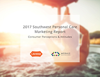
Public opinion poll discloses ideal marketing messages for $86 billion personal care industry....read more
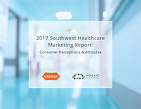
New Public Opinion Poll Reveals Surprising Consumer Behaviors About Healthcare Marketing....read more
....read more
....read more
Need fresh thinking? Help is a few keystrokes away.